
A guide to crafting scientific posters
Walk into any academic conference, and you will find a flock of bright minds, pacing beside large printed panels, rehearsing with their breath in tremor – the feared “two-minuter”. The taut eyes of seasoned experts peer in indifferent scrutiny as you string together a lax narrative on the workings of your niche and the cogs that drive it, insofar as it shall propel us towards a frontier.
Poster presentations at scientific conferences can provide newcomers with valuable opportunities to practice their dissemination skills, receive feedback on their ideas, and expand their network within the industry. But the daunt of it all is never an aspect remiss.
Conference proceedings represent for so many young researchers in Bangladesh and beyond, a first real opportunity to present their original findings and an “elevator pitch” to global eyes. Yet, the craft of making a good one is rarely taught in any classroom, lest it be so with other avenues of academia.
There may be instances in which a proceeding does not go as hoped. “I recall slaving off for months on end for my thesis findings to become worthy of the exemplary, yet only two people came to me for a chat,” has become a hallmark phrase in these circles of keen individuals.
Crafting an effective poster presentation isn’t always straightforward. Here is a guide to doing it fairly for your first flair.
Planning the poster
A scientific poster is not a shrunken journal paper. It is a conversation starter, a visual argument designed to pull passing hungry, hors d'oeuvres-hunting scientists across a crowded hall.
Before touching any software, ask yourself one question: what is the one thing I want my established peers and a layperson to walk away remembering? Write it in a single sentence. Everything on your poster – every figure, caption, and column of text – must serve that statement, so the audience opts out of the finger foods section for a minute longer.
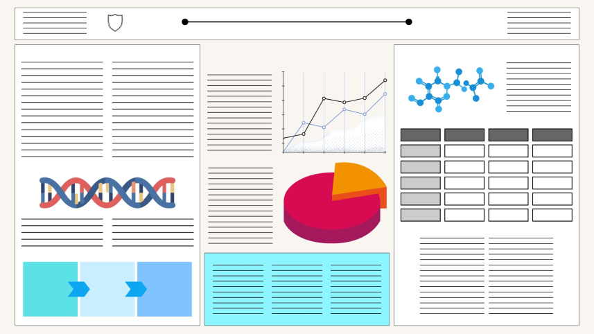
Next, sketch your layout on paper. Decide what your central visual will be: the graphs that tell the story, the diagram that explains a mechanism, and the imagery that makes the data tangible. That visual earns the most real estate on your poster. Text is secondary. Data is primary. But it is foundational to find your unique selling point.
Always plan for your audience. A poster at a specialist symposium can assume technical literacy. A poster at an interdisciplinary forum cannot, as policymakers and high-profile individuals won’t get the time to engage with jargon, not when they have 500 other submissions to observe. Time is only an enemy when you don’t make it an aide.
Architecture of persuasion
A well-structured scientific poster typically follows a logical arc that mirrors the scientific method, albeit executed with the economy of good journalism. It is detrimental to not internalise that science communication is an art form.
Here’s how you should structure the poster:
- Title: Bold, brief, and benefit-forward. Avoid jargon in the title. If your title requires a glossary, rewrite it.
- Introduction and background: Two to four sentences. Why does this problem matter? What gaps does your research address?
- Methods: Condensed. Use flow diagrams wherever possible. Readers tend to skim methods. Make them effortlessly scannable.
- Results: This is the heart of the poster—the crescendo of your pitch. Lead with your strongest finding. Use figures over tables. Label everything clearly.
- Conclusion: Two to five bullet points. What did you find? What does it mean? What comes next? This is mainly for stakeholder engagement and those who like the headlines.
- Contact information: Always include an email address and, increasingly, a QR code linking to your full paper or supplementary data.
Also, remember that white space is not wasted space. Crowding a poster with text signals anxiety, not thoroughness. Discipline yourself to cut.
Martina Maritan, a staff scientist at the Scripps Research Institute, for a feature by the American Association for the Advancement of Science (AAAS), said, "At the beginning of my science career, I thought I had to include as much data as possible and completely fill up all the available space. But then I learned that less is more. Now, I prioritise the findings I want to talk about, trying to include a maximum of three major topics and keep the text as concise as possible."
Artisanship and craft
The tools matter less than the intentionality behind their use, so the craft of presentation is a learnable skill.
PowerPoint and Google Slides remain the most accessible tools, and with care, they can produce excellent results. Set your canvas to the actual poster dimensions from the start, typically 90 cm × 120 cm or 48 × 36 inches.
Canva has democratised poster design considerably and works well for researchers with limited design experience, though its templates can feel generic. LaTeX and Adobe Illustrator offer superior control of vector graphics, making them the professional standard for those willing to climb the learning curve.
For figures and data visualisation, RStudio (with ggplot2) and Python (with Matplotlib or Seaborn) produce publication-quality graphics for the most vivid statistical findings; this applies to quantitative and qualitative experts alike. Always export figures at 300 DPI minimum. Pixelated graphs are the surest sign of a rushed poster. Some proficiency with Anthropic’s Claude Design and Claude Cowork now supersede the need. Vibe-designers will be on the rise in due time. Join the tide!
 For all latest news, follow The Daily Star's Google News channel.
 Typography matters enormously. Use no more than two typefaces or fonts. Keep body text at a minimum of 24pt as your audience will read from a distance of roughly one metre. Avoid using non-complementary colours and non-relevant graphics to beautify, as they may be an eyesore. Minimalism is the culture of this decade.
Launched in 2019 by organisational psychologist Mike Morrison, the “#betterposter” movement went viral across academia within 24 hours of being posted, and is now the gold standard for proceedings. Its central idea inverts the bulk of traditional posters, leading with a single, plain-language finding in large type so that time-pressed conference attendees can decide in seconds whether the work is relevant to them.
Maximising exposure at the conference
Printing a good poster is only half the work. Internationally acclaimed scientists have a way to sell what they reap.
In an article published on Science Careers, Marissa Clapson, a post-doctoral fellow in organometallic chemistry at the University of Windsor, says she believes the first words matter the most. As an opener, she suggests saying something like, “Would you like me to walk through the poster with you?" framing the interaction as an invitation, not a performance.
Seth Just, a principal software engineer at Proteome Software Inc., takes a quieter approach, letting a QR code do the talking for those who want depth beyond the poster itself, as he explained in the same feature.
Maxwell Shafer, another postdoctoral fellow, this time in evolutionary genetics and neurobiology at the University of Basel, prepares for every kind of visitor. In a guide published by the British Ecological Society, Shafer advises: “Have a two-minute, five-minute, and 10-minute version of your presentation ready in case your audience doesn't have much time, but still wants to know what you found.”
Maritan advises on the tactile: she prints her poster on letter-sized sheets to press into visitors' hands, alongside her email address for follow-ups.
Among all experts, one aspect remains unanimous: do not abandon your station. The most common frustration among poster session visitors is finally arriving at one that piques their interest, only to be met with nobody to answer their queries.
Engaging with colleagues and friends is an activity for the lunch break. Instead, show up and engage with the visitors at your designated spot or booth. The poster opens the door, and you walk people through what could, essentially, bootstrap your career.
References:
- Morrison, Mike. Better Scientific Poster. Open Science Framework (OSF), 2019.
- British Ecological Society. How to Create and Present a Great Conference Poster.
- Martínez Alonso, Ana et al. "How to Prepare a Scientific Poster." Science Careers, American Association for the Advancement of Science (AAAS), Science.
- Faulkes, Zen. Better Posters: Plan, Design and Present an Academic Poster. Pelagic Publishing, 2021.
- Purrington, Colin B. Designing Conference Posters.
- Regional Integrated Multi-Hazard Early Warning System (RIMES). "AI Disaster Risk Mapping and Early Warning Innovations Showcased at Dhaka Mapathon 2026." RIMES Media Centre, 7 April 2026.
Shoumik Zubyer is a researcher of the soils of Mars at the Atomic Energy Commission and SERC, and a peripatetic. Find him at shoumic.zubyer@gmail.com.


Comments