


The palette of a lifelong bond
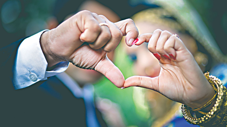
The bride walks in wearing dusty rose instead of red. The groom, rather than a white sherwani, is dressed in olive. Around them, the rituals are familiar, the music is the same and the celebration feels unmistakably Bangladeshi. Only the colours have changed. For generations, red and white have been closely associated with Bangladeshi weddings. A rich red Benarasi, a white sherwani and familiar colours for each ceremony have become part of the visual language of the occasion.
But increasingly, couples are choosing colours that reflect their own tastes. Sage, deep teal, powder blue, blush pink and champagne are finding their way into wedding wardrobes and décor, while richer shades such as emerald, midnight blue, burgundy and mustard offer another alternative.

The traditions have not disappeared. Rather, the palette around them is becoming more personal.
Why red and white endure
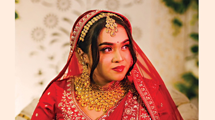
Red and white have long been part of the visual language of South Asian celebrations. Red is associated with love, passion and protection, while white represents purity and auspiciousness.
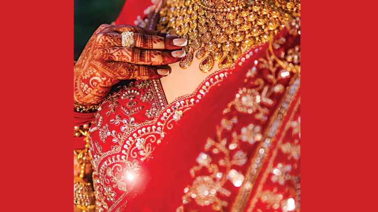
The red bridal saree also carries a sense of continuity. Wearing red connects a bride with generations of women who wore it before her, each with their own love stories. That sense of legacy is one reason the red bridal saree continues to feel relevant.
There is also a practical side. Red and white photograph well, work with most complexions and rarely require an explanation to relatives. With so many opinions invested in a wedding, familiar colours can be the safest option.
What’s changing
Red and white still command respect because of their connection to the rituals themselves. But in the activities surrounding a wedding, often spread across more than one day, couples are beginning to put a new spin on colour.
Pastels are taking centre stage, from pre-wedding events to the wedding day itself. Couples are choosing soft shades of dusty rose, pale grey, champagne and mint, pairing blush champagne organza with pale blue Jamdani, silver zardozi and pearls.
Others are choosing richer tones that offer a heritage feel without relying on red or white. Emerald, midnight blue, burgundy and mustard can create a more regal look, particularly for evening wear.
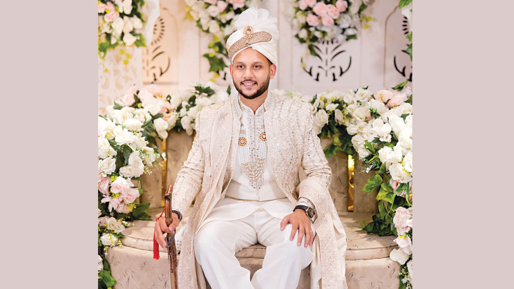
One of the simplest ways to make a statement is to choose an unexpected colour for a classic design. An olive sherwani can retain the traditional feel of the garment while giving it a more personal character. A red velvet Benarasi paired with a contrasting dupatta in green, orange, teal, violet or yellow can remain traditional without looking like every other bride in the room.
So why now?
Part of it is exposure. Couples can browse Pinterest, watch celebrity wedding clips and check out the latest wedding runways at any time, drawing inspiration from different styles and giving them their own personal touch.
Access is also a factor. Designers have expanded their wedding lines, so couples no longer necessarily have to wait months for a custom order. More couples are also contributing to their own weddings, making it easier to choose what they want without worrying as much about what others might think.
Amanna Huq, co-founder of Fashion Tunnel, says, “Not long ago, we used to design opulent red lehengas with heavy zardozi work. These days, we are getting more orders for pastels and pared-back embellishments. There is a fresh requirement for the bride’s attire to be reused.”
Choosing a colour that works
Choosing a wedding colour is not only about what’s trending on Instagram. It is about finding a balance between personal preference and what works in the real world, including skin undertones, venue lighting and the camera.
Warm undertones can work well with mustard, terracotta and olive, while cooler skin tones can complement teal, emerald and dusty rose with a touch of blue. It is also important to see the fabric under natural light rather than relying only on shop lighting.
The venue and time of day matter too. Pastels that look beautiful outdoors during a daytime ceremony can appear dull or washed out at an indoor evening event under flash. The style and skill of the photographer and videographer also play a role.
 For all latest news, follow The Daily Star's Google News channel.
 The colour should also be allowed to stand on its own. A deep red or emerald outfit with heavy embroidery, combined with chunky rainbow statement jewellery, can quickly become visually cluttered. Bright fabrics can instead be paired with subtle antique gold or pearls, while dramatic polki or kundan jewellery can be reserved for ivory and champagne-coloured outfits.
Huq says, “Couples are tired of looking like an extension of their parents’ wedding album. They want a colour scheme that is more authentic to them. New clients are requesting the softer hues of champagne, deep greens, and multiple pastel shades for their pre-wedding events, ditching the traditional prescription that each occasion should be the brightest primary colour.”
The hesitation, however, remains when it comes to moving away from red for the actual biye.
There is a subtle struggle between individual preference and cultural custom. The middle ground may be keeping red or ivory for the main wedding ceremony while reworking the colour palette for the Holud, Sangeet and Bou Bhat.
The groom and the wedding party
The groom is increasingly part of the colour conversation and has a voice and style of his own.
More grooms are moving away from the traditional white sherwani towards blush pink, midnight blue or olive shades that complement the bride. Sometimes the main outfit remains traditional while the stole, tie or pagri introduces a different colour.
The wedding party is changing too. Instead of mismatched, cookie-cutter looks, there is a growing preference for a carefully selected, one-hued palette.
Bridesmaids can choose from different colours and styles within an approved palette, while groomsmen can select cuts that suit them and feel comfortable alongside the groom. Dusty rose, sage and warm metallics have been popular choices because they photograph well and are flattering in real life.
A palette of their own
Wedding style is cyclical, moving from crimson to pastels to jewel tones. But great style is not necessarily about following a trend.
When a couple wears something that surprises you, it is often because it feels like them, rather than because it belongs to one side of a traditional colour palette.
Burgundy and white are here to stay and will continue to feature in many weddings. What has changed is that choosing something else no longer feels like such a gamble.
Ultimately, the colour of a wedding is becoming less about what is expected and more about what feels right to the couple. Decades later, that personal choice may be what makes the photographs feel most like their own.
Comments